
Welcome to Beringia’s new website! You likely noticed our updated logo, and the beautiful image on our home page. Here’s some background.
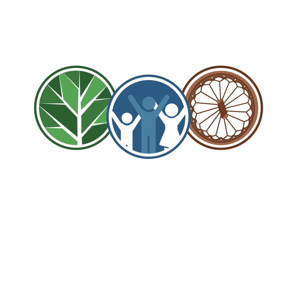
Our new logo captures a fresh look that speaks to three foundations of our community-led planning practice.
The green circle represents the sacredness of Indigenous lands and the need to plan and manage lands and built environments with care for seven generations.
The blue circle reflects our commitment to inclusivity, social relations and planning together in a good way.
The brown circle represents our respect for Indigenous cultures and languages and the significance these have for community development and Nation rebuilding.
Together, these circles represent the holistic nature, relationships and worldviews of Indigenous peoples and all things sacred. Honouring and respecting Indigenous ways of knowing and being through past, present and future generations guide our practice and protocols of working with communities.
The painting of the canoe in the home page banner represents a collective journey and process of community members coming together and deciding how they are going to paddle forward to strengthen their individual and collective lives. Community-led planning is about people deciding a pathway of desired change to strengthen community self-determination and celebration.
We hope you enjoy our new website! Many thanks to Laneway Media for developing our logo and the website and to MoritaArt Designs for creating the banner.